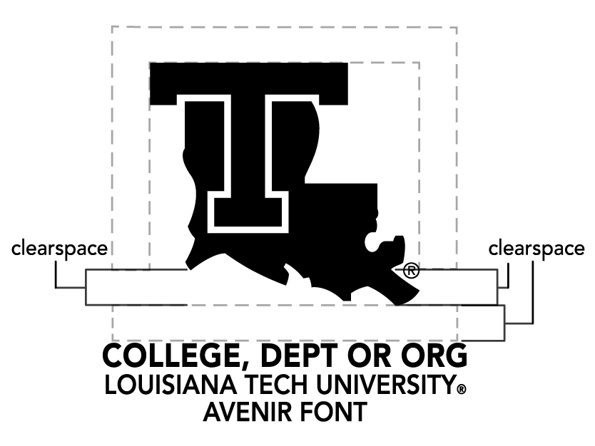
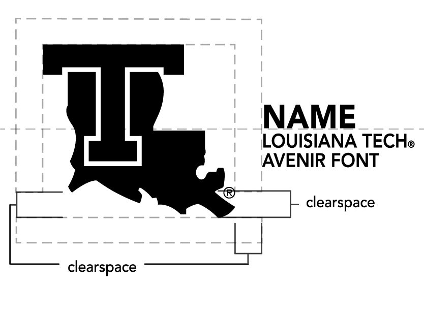
Clearspace is the term for a specific amount of space that a logo must have on all sides, no matter where it is used. The use of clear space ensures that a logo has maximum visibility and impact.
Cluttered designs distract your audience from everything that the design contains. Especially in the case of a logo, we want our brand to be recognized. Our logo is what connects with our students and community and it is the No. 1 item they will associate with our brand.


As shown in the examples above, using clearspace places importance on our University’s logo.
