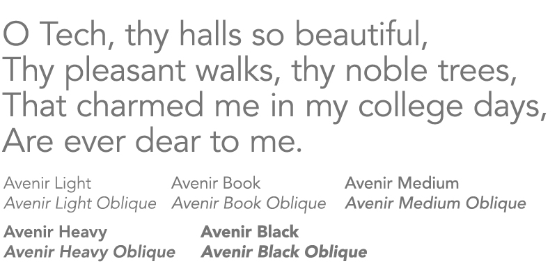
Communication from the University is most effective when the words are consistent in both content and appearance. Louisiana Tech University’s official fonts have been selected to communicate a brand that is both traditional and modern.
Please be sure to avoid:
- condensing, excessively tracking, or horizontally scaling fonts
- using outline type or type with drop shadows
- using more than two fonts in a design
These font families were carefully chosen to reflect the University’s brand identity.
Primary Typeface
Avenir is the university’s primary typeface. It’s a clean, modern, sans-serif typeface that works well for display copy, body text, and everything between.
- Primary Sans Serif Font: Avenir or Avenir Next
- Alternate: Montserrat or Nunito
- Source Lato is the preferred font for digital communications including websites and emails

Long-form Typeface
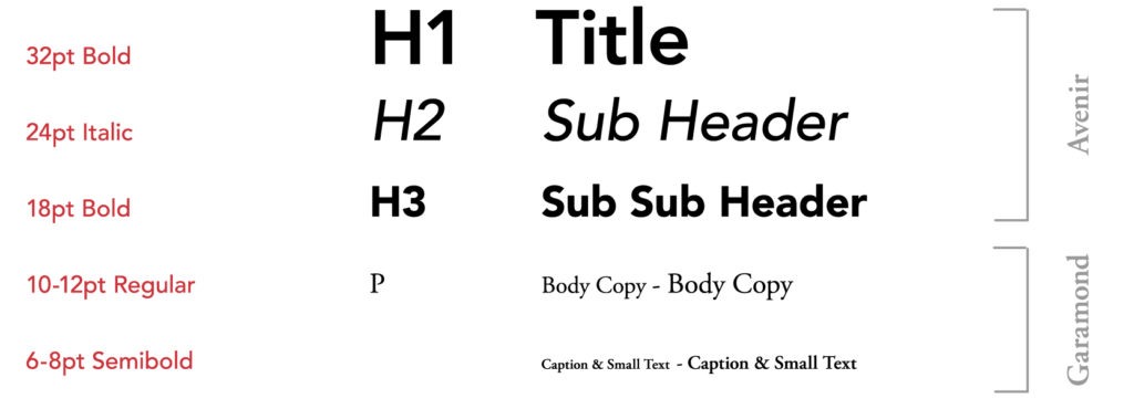
Garamond is an acceptable serif typeface for body copy in long-form print publications such as magazines or annual reports. It may be used when the primary fonts are unavailable but should not be used for display copy.
- Primary Serif Font: Garamond
- Alternate: Times or Palatino
Garamond is the preferred font for formal print documents such as reports, printed letters, business cards, and other formal items.

Specialty and Display Typefaces
A display font may be used when you need to create a mood or set the tone of a piece. Typically used for type set larger than 14 points, a display font should only be used for headlines or graphics. It should be used sparingly and tastefully and should never be used as body text. Script fonts should never be used in all caps.
These fonts (and many others) can be found online. Be aware most fonts online are licensed; double check before you use.
The following are recommended secondary fonts. These are used to add interest and vibrancy to designs while remaining true to the Louisiana Tech brand.
- Palatino
- Myriad
- Tahoma
- Georgia
Font Stacks for Web and Digital
The following font stacks should be utilized when designing for digital media. They help control the look of your communications even if your user’s computer doesn’t have the primary font installed.
- Sans serif: Lato, Open Sans, Verdana, Helvetica, Arial, Sans-serif
- Serif: Garamond, Bookman, Times, Times New Roman, Serif
Contact the Office of University Communications at web@latech.edu for information on activating web fonts on your site.
Font Sizing
One of the main principles of typography is legibility. You can be flexible in your font sizing, as long as your overall layout is comfortable for your target audience to read.
A standard font size for body text on print is 10-12 pt and 5–10 percent larger for subheads, while the minimum legible font size is 4-6 pt.
To assist readers with visual impairments, font size should be 14 pt, and no smaller than 12pt for body copy.
Some common typography tips:
- Keep it consistent, set your font size by style. (i.e. H1 heading, H2 subheading, H3 body)
- San-serif is more readable compared to Serif, which is usually used for body text.
- Font and Type setting are different for print and web versions. For instance, fonts for use on the web are optimized and use a smaller range of size.

